Friday, February 13, 2015

UF Dashbuilder and the new data set architecture

   Uberfire and the GWT echosystem brings not only a lot of exciting cool features but also an extremely powerful development environment. UF Dashbuilder stands for the Uberfire-zed version of Dashbuilder.  Since last year, we've been working on rewriting the whole Dashbuilder application on top of Uberfire and GWT. During this migration stage we have rewritten, almost entirely, the backend layer and some of the UI components. There is still a lot of work to do, as we know, but we want to start sharing what we have achieved so far.  In previous articles we showed how to use the technology to build dashboards using the Displayer API. Today we're going to explore the Data Set architecture, how to define and deploy data sets in Dashbuilder and make the dashboards feed from them.

   So what is a data set? Well, basically, it is a set of columns populated with some rows. Another valid definition is: a matrix of data composed by timestamps, texts and numbers values. A data set can be stored into different systems: a database, an excel file, in the memory of an app. or into a lot of other different systems. The good news is that in Dashbuilder there exist an standard way to define a data set, regardless where the data set is stored.

Data set definitions


  Every time we want to provide access to a given external data, a data set definition has to be deployed. That definition contains information about:
  • where the data set is stored, 
  • how can be accessed, read and/or parsed, and
  • what columns contains and of which type.

    Let's take for instance the following data set definition:

CSV data set definition example

     The definition is a JSON document containing the following properties:
  • uuid: A unique universal identifier. 
  • provider: The method used to get access to the data set. Depending on the selected method a set of extra properties need to be provided, For instance, the filePath is needed in CSV along with separatorChar, quoteChar and escapeChar, in order to parse & read the CSV file. 
         At the time of this writing we support the following providers:
    • CSV, for accessing data stored in comma-separated-value files.
    • SQL, for getting data from relational databases through SQL queries.
    • BEAN, a Java bean interface for generating data sets directly from Java. 
    • ELASTICSEARCH, for querying documents stored into Elastic Search indexes.
  • isPublic: if set to true means that it can be accessed from the UI editors by anyone with the right permissions. 
  • columns: this section is used to define which are the data columns we want to be part of the data set, including their type and format.  Columns not defined here will be considered as non-existing  even if they are part of the data stored. There exist 4 types available:
    • date: for date-time values.
    • number: for numeric values.
    • label: for text context that can be categorized.
    • text: for non-categorizable text content (more info at the Data set lookups section).
  • pushEnabled
  • pushMaxSize
  • refreshTime
  • refreshAlways: this 4 properties are related to the caching & refresh mechanisms. Will talk about that later on in the Caching & Refresh section.
    All the properties listed above are common to all the providers, regardless of its type. Let's take a look at some other data set definition examples:
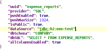
SQL data set definition   
   For SQL data sets you need to specify an existing app. server dataSource, the dbSchema (optional)  and the dbSQL used to get the data. As you can see the allColumnsEnabled is specific and tells the provider that we want to consider all the columns in the SQL as part of the data set. As for the column types they will be inferred from the database metadata. If we want to override an existing column definition we can still define a columns section as in the CSV example.

Java Bean generated data set definition

   The Java Bean provider is an extension mechanism that allows to delegate into a Java class the data set generation. In this case we only have to specify a fully qualified class name plus an optional set of parameters that will be passed to the Java Bean.

Elastic Search data set definition
   The Elastic Search provider is a very good example of integration with a nonSQL storage. The columns serverURL, clusterName, index and type are specific and tells the provider what concrete Elastic Search index and document type this data set defines.


Data set deployment


  As we've seen so far, Dashbuilder supports several data set types, and it offers a common mechanism for defining such data sets. Once a data set is defined it needs to be deployed, otherwise it won't be accessible to the Dashbuilder modules.

   Dashbuilder is delivered as a web application archive (WAR file). Inside this WAR file there exists a directory called dashbuilder.war/WEB-INF/datasets  containing all the data set definitions. Deploying a new data set it's as easy as creating a .dset file containing our JSON definition and copying that file to the deployment directory. Once detected, the data set definition will be loaded and registered automatically in the Dashbuilder data set registry. Changes made to the deployed files will be also detected. When this happens, the entire data set definition is reloaded and any cached data is removed (see the Refresh & cache section below).

   The following video, shows a live demo of how to deploy a data set at runtime and how the dashboards can get access to it automatically.


   The process described is more intended for technical people. In the next few weeks though, we will be working on a new feature for allowing the end users to edit & deploy its data sets from the UI, the Data Set Editor. We also plan for storing the data sets definitions into GIT repositories through the Uberfire's VFS service as well, to make it easier to share and move data sets between installations.


Data set lookups 


   So far so good. The next question is: how the charts in a dashboard get the data they need? Well, once a data set is deployed is ready for receiving lookup requests. For instance:

  • Get the total amount of expenses by department
  • Get the outstanding sales till the end of this year, grouped by office
  • Get the orders received in the last 5 minutes
  • Get the travel expenses by employee, only from the sales department 
  • Get the sales pipeline expected for the next few years 

  As you can see, a data set lookup request is basically a query over an existing data set, but with some constraints. To be more specific, a lookup request is a sequence of data manipulation operations which produce a resulting data set. The set of operations supported are:
  • filter: to get a subset of the whole data set by means of specifying constraints on one or multiple data set columns.
  • group: to categorize the whole data sets into groups. LABEL and DATE are the only supported column types. 
  • sort: to sort the resulting data set by one or multiple columns.
  • trim: To limit the maximum number of rows the resulting data set must have.

  A lookup request takes an input data set and produces a resulting data set. As illustrated in the following diagram:

Data set lookup request
 
  So the way to express some of the examples above as a lookup request is as follows: 
  • Get the total amount of expenses by department
        .dataset("expenses")
        .group("department")
        .column("department")
        .column("amount", "sum")
  • Get the outstanding sales till the end of this year, grouped by office
        .dataset("expenses")
        .filter("date", timeFrame("now till end[year]"))
        .group("office")
        .column("office")
        .column("expectedAmount", "sum")
  • Get the travel expenses by employee, only from the sales department 
        .dataset("expenses")
        .filter("department", equalsTo("sales"))
        .group("employee")
        .column("employee")
        .column("amount", "sum")

       How this lookup requests relates to the displayers/charts in the UI? The answer is that every displayer, no matter whether is a chart, a table or a selector, performs a lookup request in order to retrieve the data required. Obviously, the set of operations in the lookup request varies depending on the chart type. For instance, a pie chart feeds from a two column data set where the first column is usually the result of a group operation, whereas a table displayer can feed both from grouped and non-grouped data sets and they also permits a variable number of columns in the resulting data set.

      For those interested in the internals or just want to see how the Dataset API looks like, I recommend taking a look at the different test cases existing on GitHub.

       Using the Displayer Editor users can configure all the data retrieval settings, as shown in the next screenshot.

    Displayer Editor UI


       From this editor, users can define the lookup's filter, group, and sort operations as well as configuring the resulting data set columns. The editor is adaptable, than means that the available settings varies depending on the displayer type selected. Actually, what the application is doing behind the scenes is building and executing a single lookup request over the selected data set.

    Data providers


        So far, we have learned how to define, deploy and perform data lookup requests on a given data set. Now we're going to go a little deeper in order to describe how the Dashbuilder core deals with the processing of data set lookup requests.

      As we described before, every data set definition is linked to a provider: CSV, SQL, BEAN or ELASTICSEARCH. Each data set lookup  request is delegated to the proper data provider implementation which is responsible for resolving the request. In case of an SQL dataset, the lookup request is transformed into an SQL query which contains all the lookup's filter, group and sort operations.  Thanks to the existing provider interface, Dashbuilder does not have to take care about the lookup request resolution. We can start with a CSV data set definition and move our data to a relational database later on and all our implementations on top of such data set won't break, this includes the dashboards we build and any other client implementations we might have.

      The next diagram shows the internal pieces of the Dashbuilder's Data Set Subsystem. Every lookup request received is processed following these steps:

    1. Get the data set definition the lookup request is referring to.
    2. Get the provider implementation the data set is linked to.
    3. Delegate into the provider the processing of the lookup request. 

    Data Set Subsystem Architecture


       In the diagram, we can see the DataSetDeployer component which looks for data set deployments & updates.  There also exists an especial type of provider called  StaticProvider which holds and resolves lookup requests in memory. Unlike the SQL or ELS providers which execute queries against the external data storage, the CSV and BEAN providers are not query processing engines. So what they actually do is to read/generate and register the whole data set into the static (in-memory) provider. This is specially helpful for small data set use cases. For big data scenarios you should definitely consider using an SQL or ELS provider.  

       When the first lookup request over a CSV data set is requested, the CSVProvider loads, registers and delegates into the StaticProvider the lookup request processing.  So the CSV and BEAN providers are just data set loaders since the real processing is carried out by the static provider. The static provider relies on a data set operation engine implementation capable of resolving a sequence of filter, group and sort operations over a data set (further details in the next section).


    Caching & Refresh


       In the beginning of this article we stated that a data set definition may contain four extra properties:

    • pushEnabled (false by default )
    • pushMaxSize (1024Kb by default )
    • refreshTime (-1=disabled by default)
    • refreshAlways (false by default )

    All of them are related with the caching & refresh mechanisms. Let's take a look at the following diagram which depicts the Dashbuilder's client/server architecture.   


    Client/Server Architecture 

       Imagine we have an end user interacting with a dashboard. Let's see what happens when a chart issues a data set lookup request:

       1. The DataSetClientServices class receives the request  and 
       2. ... asks the server for the data set metadata which contains the data set definition, size, ... 

       If  "pushEnabled=true" and "pushMaxSize<dataSetSize" then,

       3. The whole data set is pushed to the browser. 
       4. The data set is registered into the ClientDataSetManager.
       5. Finally, the initial (and the subsequent) data set lookup request is processed on the client.

       If  "pushEnabled=false" or "pushMaxSize is not < dataSetSize" then the lookup requests is always processed in the backend. 

       The push mechanism allows for uploading an entire data set to the user's browser. It applies to any kind of data set, no matter what is the provider type. It's a kind of browser caching mechanism. The main motivations behind this mechanism are the following:

    • Improve the performance. Once a data set is loaded all the data set group, filter sort operations performed issued from the UI are resolved without any further calls to the backend.
    • Support a pure lightweight client approach. The whole Dashbuilder UI components could be used without the need of the backend layer. Data sets can be registered through calls to the  ClientDataSetManager and all the lookup requests will be resolved at a client side. Obviously, this approach is not suitable for large data sets.


       The DataSetManager interface is the main entry point for any data set access operation, including the lookup requests. As shown in the diagram, there exists two implementations of the DataSetManager interface, one in GWT and  a server implementation in pure Java.  Both depend on the DataSetOpEngine, which is a GWT shared implementation that can run on both client & server, this makes possible the ability to process lookup requests in the client side.


       So far, so good. However, what if a data set is pushed and the source data is updated? or, for instance, what if a CSV file changes or if a new document is added to an Elastic Search index? Here is when the two remain settings refreshTime & refreshAlways  comes into action.


       Imagine a database which is updated every night. If we want to get the most updated data then we must set "refreshTime=1day" and "refreshAlways=true". On the contrary, if our data changes every now and then then we must set "refreshAlways=false" which means that the system will ask the database (once a day) whether the data set is outdated before invalidating the current data set.

       For SQL/ELS data sets , it makes no sense to set the refresh settings if push is disabled, since all the lookup requests will always be executed against the external storage.  Otherwise, for CSV/BEAN it always makes sense, since the contents of the data sets are always loaded and cached in the backend.

      For every data set with refresh enabled, an invalidation task is registered into the Scheduler component, as shown in the diagram above. When the refresh interval is reached, the task is executed,  a DataSetStaleEvent is fired and any data set cached data (both on the client & backend) is removed.

       From the UI perspective we can control in detail when we want a chart to get refreshed. The refresh settings are located in the Displayer Editor > Display tab > Refresh category. One option is to refresh every time a DataSetStaleEvent is received. Another option is to force to refresh every N seconds. This last option is  more suitable for real-time use cases.
     
       To sum up, if we know our data is going to change and if we want our dashboards to be notified on every update we must enable the refresh settings. Optionally, if we want to improve our dashboard performance then we can go for enabling the data push feature, but only if our data set is small enough.

       In next articles we will talk about real-time dashboards, how to build them and how to integrate Dashbuilder with a non SQL storage like Elastic Search. Stay tuned!
     

    Friday, January 23, 2015

    Dashbuilder Overview

    For those of you who would like to learn more about Dashbuilder, Jan Hrcek QE Engineer at RedHat, published an article on DZone. The article gives a conceptual overview of the application and presents its main features. 

    Thanks Jan for this contribution! 

    Friday, December 19, 2014

    Using filtered SQL queries for building big data dashboards


        Dashbuilder is a tool I like to describe as a “micro” BI. It lets the user create dashboards and showcase their data using pie, bar or line charts as well as display data in a tabular form. Data could be loaded from plain text like CSV files or query from a database connection. When data is small enough, Dashbuilder can handle pretty well the whole set in memory as far as it doesn't exceed the 2MB size limit. However, most of the time, our data sets are bigger and we can't upload all the data for Dashbuilder to handle it by its own. Is in these cases where database backed queries can help us to implement nice drill down reports and charts without preloading all the data. 

       Let's take as an example a very simple stock exchange dashboard  which is fed from two database tables:


        The dashboard displays some indicators about several companies from several countries selling their shares at a given price on every day closing date. The dashboard displays 4 KPIs  (Key Performance Indicators) as you can see in the following screenshot: 


        All the indicators are displaying data coming from the two database tables defined above.


    • Bar chart - Average price per company
    • Area chart - Sales price evolution
    • Pie chart - Companies per country
    • Table report - Stock prices at closing date 

       At the end of this article [1] you'll find detailed instructions about how to download and install this example dashboard. What we're going to start discussing next is the two strategies we can use for building a dashboard. This is an important aspect to consider, specially if we're facing big data scenarios.


    The in-memory strategy


       This strategy consists in creating a data provider which load all the data set rows by executing a single SQL query over the two tables.  

       SELECT C.NAME, C.COUNTRY, S.PRICE_PER_SHARE, S.CLOSING_DATE
      FROM COMPANY C JOIN STOCK S ON (C.ID=S.ID_COMPANY)

      Every single indicator on the dashboard will consume the same data set. When filters are executed from the UI no further SQLs are executed since all the calculations are done over the data set in memory. The following video shows a browser window and a bash console showing that only a single SQL is executed when the dashboard is initialized.


      Pros:
    • Data retrieval logic keeps very simple
    • Only a single data provider is needed
    • Faster configuration of  KPIs since all the data set properties are available at design time
    • Multiple indicators from a single data provider
       Cons:
    • Can't be applied on medium/large data sets due to poor performance


    The native strategy


      The native approach consists in having a data provider for every indicator in the dashboard. instead of loading an handling all the data set in memory. Every KPI is told what data has to display. The next video  shows a full SQL based version of the sales stock dashboard. As you can see, every time the user filters on the dashboard, some SQL queries are executed. No data is hold in memory, the dashboard is always asking the DB for the data.


      As you can see, on every filter request the SQLs are parsed, injected with the filter values and re-executed. The SQL data providers are the following:

      Bar chart - Average price per company

        SELECT C.NAME, AVG(S.PRICE_PER_SHARE)
      FROM COMPANY C JOIN STOCK S ON (C.ID=S.ID_COMPANY)
      WHERE {sql_condition, optional, c.country, country}
      AND {sql_condition, optional, c.name, name}
      GROUP BY C.NAME

      Area chart - Sales price evolution

      SELECT S.CLOSING_DATE, AVG(S.PRICE_PER_SHARE)
      FROM COMPANY C JOIN STOCK S ON (C.ID=S.ID_COMPANY)
      WHERE {sql_condition, optional, c.country, country}
      AND {sql_condition, optional, c.name, name}
      GROUP BY CLOSING_DATE

      Pie chart - Companies per country

      SELECT COUNTRY, COUNT(ID)
      FROM COMPANY
      WHERE {sql_condition, optional, country, country}
      AND {sql_condition, optional, name, name}
      GROUP BY COUNTRY

      Table report

      SELECT C.NAME, C.COUNTRY, S.PRICE_PER_SHARE, S.CLOSING_DATE
      FROM COMPANY C JOIN STOCK S ON (C.ID=S.ID_COMPANY)
      WHERE {sql_condition, optional, c.country, country}
      AND {sql_condition, optional, c.name, name}


       As you can see every KPI is delegating the filter & group by operations to the database. The filter magic happens thanks to the {sql_condition} statements. Every time a filter occurs in the UI the dashbuilder core gets all the SQL data providers referenced by the KPIs and it parses/injects into those SQLs the current filter selections made by the user. The signature of the sql_condition clause is the following:

        {sql_condition, [optional | required], [db column], [filter property]}  where:

    • optional: if no filter exists for the given property then the condition is ignored. 
    • required: if no filter is present  then the SQL returns no data.
    • db column: the db column where the current filter is applied.
    • filter property: the UI property which selected values are taken. 

     Pros:
    • Support for high volumes of data. The database tables need to be properly indexed though.
     Cons:
    • The set up of the data providers is a little bit more tricky  as it requires to create SQL queries with the required filter, group by and sort operations for every KPI.

       When designing a dashboard never forget of thinking thoroughly about the origin, type and the volume of the data we want to display in order to go for the right strategy.


    -----------------------------------------------------------------------------------------------------------

      
    [1]    These are the steps to download an deploy the Stock Trade sample dashboard: 
    1. Download  & deploy the Dashbuilder webapp on your favorite app server - Installation instructions.  
              (You can also build from sources)
    1. Extract the contents of the following zip file into  dashbuilder.war/WEB-INF/deployments folder
    2. Create the stock trade database tables. Use or adapt  the H2 script file stocktrade-h2.sql provided.
    3. Start the app. The dashboard should be automatically deployed.

    Wednesday, August 6, 2014

    Dashbuilder 6.1.0 released

       It's been 7 months after the latest release of Dashbuilder. During this time we've spent most of the time testing the application on other platforms such as WebSphere or WildFly as well as adding several bug fixes. As a result, the current 6.1 is much more stable and offers wider compatibility with other platforms.

       New features added:
    • Support for the WildFly 8.x and WebSphere 8.x application servers
    • Ability to embed KPIs into third-party applications  (as we advanced a few months ago in this  blog entry)
      The links to the release artifacts can be found on the project website http://dashbuilder.org     

    Wednesday, July 23, 2014

    New tabular reports component

       As we mentioned in a previous post (Rich interactive dashboards in uberfire), the data viewer layer is not tied to just one type of visualization technology, but instead supports pluggable renderers. This means that, if so desired, each of the components of a specific dashboard can be configured with it's own specific rendering technology, independently of the renderer its fellows components might use.
    On the other hand it's also possible to have only the tables report components, for example, to use a specific table rendering technology, while all the others use the default renderer (which, for now, is the Google Charts Visualization library). This is what we'll illustrate in this blog entry.

       Recently we've added a new table visualization component, which in a foreseeable near future will become the default rendering technology for table reports, replacing the previously mentioned Google library for this type of displayers.

       So, how do we tell the framework that it should visualize a table using this new renderer? Let's go back to an example from the previous post to illustrate this:

    The sales pipeline dashboard.

       As you can see the 'Sales pipeline' dashboard that is shown in the above image consists of a line chart, a few pie charts, a bar chart, and finally, a table report. The latter is being visualized using the (still) default Google visualization library. Let's check out how the table report of this dashboard is setup:
    The table report setup

       As you can see, this is fairly straightforward; through a sequence of API calls we tell the framework to configure a table renderer component, with its title, the default ordering column and sense, the page size, the columns it should display, and the data set it should work with.

       This setup displays the table as it can be seen in the first image, with the default google visualization library. Let's now change this to our new table component. For this to happen we need to adapt the above configuration as follows:

    Set a specific renderer

       So, it's as simple as adding a call to 'renderer( <rendererID> )', to the component's setup to get the job done and that's that! The result is shown in the image below: 

    New table component renderer.
       As you can see, the table report is now visualized with our new table component. It offers several improvements over the google table renderer:

    • it's based on a standard widget-set, so no dependency on third party (possibly closed-source) libraries,
    • the possibility to hide columns through a column selector pop up,
    • the ability to manually adjust the column widths,
    • the ability for the table to emit filtering events that occur within it (e.g. someone selects a specific country or product), so that other components can adapt their content accordingly (see also the entry on filtering: An introduction to displayer filtering )

    Below we've included a small screen cast to illustrate some of these features:

    Tuesday, July 22, 2014

    An introduction to displayer filtering

       One of the most interesting features of interactive dashboards is the fact that they consist of data visualization components that can be made responsive to events that happen within some other data displayer component, which is usually being shown in the same dashboard. Equally important is that data visualization components can be told to notify to others that some kind of 'event' has happened within it, e.g. a data filter event in a pie chart, or some value that was selected inside a table report cell.

       So how is this achieved in dashbuilder?

       Check out the following example of what could be a sales dashboard:

    An example sales dashboard

       We have a meter chart, a bubble chart, a line chart and a couple of bar charts in there, representing some possible sales indicators. Now imagine that a sales manager wants to check the correlation between all of these for a specific country (bubble chart), or for a specific product or employee (bar charts). If these charts were simply static visualizations, he/she wouldn't be able to do that, rendering the dashboard practically useless for detailed data interpretation.

      So, the importance of being able to configure the charts, whatever their type, and where necessary (it might not always be desirable nor useful), so that they can respond to external and / or 'self' events (i.e. filtering actions), and also be able to notify other charts of those is beyond doubt.

       As you might already know, all data visualization components in dashbuilder can be configured through a very straightforward and easy-to-use API. Take the bubble chart in the above dashboard, for instance, which is setup as follows:

    The bubble chart setup

       Pay attention to the call to the 'filterOn( ... )' method, surrounded by the red rectangle, this is where all the filtering 'magic' happens. Let's dig a little deeper into what this method offers.
    As you can see it accepts three boolean parameters:

    • The first one will configure the data displayer so that it will respond to the filtering events it generates itself, i.e. the event generated by the displayer will affect its own content. Say for a second we were to have this parameter to 'true' in the 'By product' bar chart configuration. If we were then to click on 'Product 11' for example, the result would be the following:


    An 'auto'-filtering bar chart
       We observe that only the two bars corresponding to 'Product 11' have remained present in the 'By product' graph. It's up to the dashboard designer to determine if this effect is what is convenient for the type of dashboard and for the type of graph in its specific context. In this case we might wonder if, functionally speaking, it makes sense to have a bar chart auto-filter itself, but please note that the auto-filtering option also plays an important role in the ability to apply 'drill-down' to data displayers. However, this  will be the topic of a future post.

       Also note that when we clicked on the 'Product 11' bar, all the other graphs, with the exception of the meter chart, automatically adjusted their content to the newly set filter. This is because of the
    • Second filterOn parameter, which will configure the data displayer so that it will notify the filtering event that has occurred within it to others. Others? That is, every other displayer that has registered itself to listen to the events within a certain context (basically, although not strictly, a dashboard). This is achieved by coordinating displayers through a 'DisplayerCoordinator' component, as illustrated below:

      Coordinate displayers amongst themselves
      Every component that registers with this coordinator will be notified of the events that occur within the other components in the same coordinator instance, but only if its
    • Third filterOn() parameter, which tells a displayer to respond or not to the events that are notified throughout a specific dashboard, is set to true. For the sake of this example, this parameter was set to 'false' for the meter chart and, as you can see from the screenshot where the bar chart auto filter was demonstrated, the meter chart has not changed its content.
    That's it for our brief introduction to displayer filtering, in a future post we will broaden this subject and also introduce the ability to 'drill down' in the data represented by a displayer. Stay tuned!

    Wednesday, June 25, 2014

    Rich Interactive Dashboards in Uberfire

        Uberfire is one of the latest & coolest projects within JBoss middleware. The Uberfire project was kicked off about two years ago. Despite it's still on the release 0.5  I think is mature enough to start bringing some of the Dashbuilder features to it. Uberfire leverages the GWT & Errai technologies and provides a rich framework to develop desktop-like rich internet applications.

     The next video (don't forget to select HD) shows a live showcase with some interactive sample dashboards built using the Dashbuilder client API.  All the dashboards are fed from a dynamically generated client data set. So there is no interaction with the backend. All the operations (group, filter, sort) are performed on the client side. The Dashbuilder architecture allows for handling data sets on both client & server though. For demo purposes we have gone for the client approach as it is easier to implement.

       In next blog entries we will walk through the architecture internals as well as the APIs. Today, I'm just going to give an overview of how these sample dashboards have been built.


       The four dashboards (see screenshots below) are fed from a dynamically generated data set (the sales opportunities data set - SalesDataSetGenerator.java),  which is a Bean type data set generator that registers a data set at Showcase initialization time.  The dashboards themselves are just GWT UI Binder widgets composed by a bunch of data viewer instances spread on the same page layout.

    Sales goals
    Sales goal dashboard
    Sales pipeline
    Sales distribution by country
    Sales table reports

       Let's take for instance the first dashboard. The UI Binder template (SalesGoals.ui.xml) is used to lay out all the charts properly.  Each chart is assigned a unique identifier used within the dashboard  (SalesGoals.java).

    Dashboard UI binder template

       The chart definition is composed by two parts, both defined using a very simple but powerful API.
    • A data set reference the chart is going to display. Here we can specify a plain data set or a data set lookup which is just a sequence of operations (filter, sort, group) performed over an existing data set.
    • A display configuration or how we want to visualize the data. There are several types of visualizations - pie, bar, line, area, meter, map bubble charts, tables, hierarchical trees, etc... The display settings will depend on the type of visualization chosen.
    Data Displayer API sample

        As I said, we'll dive into the API internals in next blog entries. For now, just taking a look at the examples is the quickest way to figure out how this API works.

        One last note worth to mention is that, right now, the default rendering technology used is the Google Charts Visualization library. We went for Google because it was the quickest road to follow in order to get an early prototype. Nevertheless, the data viewer layer is not tied to any specific rendering technology as it supports the concept of pluggable renderers. So, in the future, it'll be possible to have several renderers available and have every chart decide which particular one to use.
     
       The project is hosted on Github. Despite it's in a very early stage of development we're pushing hard to bring many new features in the next few months:
    • Data visualization editors
    • Drag&drop dashboard composer
    • Renderer based on the D3 library
    • Support for real-time dashboards
    • RESTful API for remote dashboard interaction

    That's all. I encourage you to clone the project, build, run it and play with the examples.

    Enjoy it!